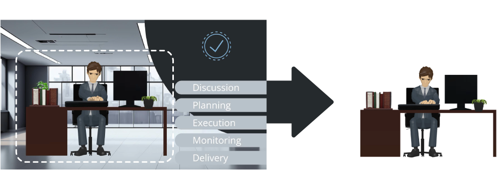
Project Completion Journey illustrates the key stages of turning an idea into a finished project. It begins with Discussion, where ideas are shared, goals are aligned, and challenges are identified. This sets the stage for Planning, which involves mapping out tasks, allocating resources, and creating a clear timeline.
The third stage, Execution, brings the plan to life as team members work together to complete the tasks. During this phase, Monitoring ensures everything stays on track through regular check-ins and adjustments. Finally, the project reaches its conclusion with Delivery, where the finished product is shared with stakeholders.
Why Bullet Points Are Commonly Used #

Bullet points are an effective way to simplify and organize complex ideas. Instead of overwhelming the audience with a long, dense paragraph, bullet points break information into smaller, manageable chunks, making it easier to digest.
Presenting ideas with bullet points ensures key points stand out. It draws attention to the most critical information, helping the audience focus on what matters most without getting lost in excessive details. Audiences are then more likely to remember information presented in lists or concise formats.
Creating “Background” of the Bullet Points #
When we talk about the “background” of bullet points, it does not only mean static visuals like a plain color, pattern, or scene. It can also include moving elements or animations that enhance the overall presentation. For example, in the case of the Project Completion Journey, the animated character typing on a computer serves as the “background” for the bullet points.
 #
#
Why Use a Moving Background #
When only key points are displayed on the screen, it can feel static and monotonous, especially during longer presentations. Adding a subtle moving element, like a character or a simple animation, can make the screen more engaging and help hold the audience’s attention.
Maintaining Focus on the Key Points #
When only key points are displayed on the screen, it can feel static and monotonous, especially during longer presentations. Adding a subtle moving element, like a character or a simple animation, can make the screen more engaging and help hold the audience’s attention.
- Maintaining Focus on the Key Points: However, animated backgrounds come with a challenge—ensuring the audience remains focused on the main points. Here are two tips to address this:
- Subtle Movements: Keep the animations in the background minimal and non-distracting. For instance, a character typing, as in the example, offers gentle movement that does not pull attention away from the text.
- Clear Visibility: Place your bullet points on a base, like a solid block or subtle shape, to ensure the text stands out clearly. This way, even with a moving background, the audience can easily read and focus on the key points.

Enhancing Bullet Points with Related Images and Animations #
Another way to elevate your bullet points is by pairing them with related visuals or animations. Using images or animations relevant to your points can make the presentation more engaging and help your audience better understand and remember the content.

For example, as you discuss each point in the Project Completion Journey, you can display a corresponding image or animation, such as Folders image for the Planning step. Use enter and exit animations to introduce these visuals at the right moment, aligning them with the point being discussed. VP Online makes it easy to achieve this effect with just a few clicks. Add animations, pair them with bullet points, and create dynamic, engaging presentations effortlessly. Try it now!


